A Journey of Serenity and Self-Discovery: Mastering User Experience (UX) and Brand Identity
The modern internet is a chaotic place. It is a landscape filled with flashing pop-ups, slow-loading pages, cluttered menus, and aggressive notifications. For the average user, browsing the web is no longer an exploration; it is a source of low-level stress. We call this “Digital Anxiety.”
When a potential customer lands on a cluttered website, they don’t feel welcomed; they feel overwhelmed. They bounce immediately, seeking a simpler, quieter place to solve their problem.
To succeed in 2026, businesses must offer the opposite of chaos. They must offer Serenity.
But creating a serene digital environment requires more than just minimalism; it requires a profound journey of Self-Discovery for the brand itself. You cannot build a clear experience for your user if you do not have a clear identity for yourself.
This post explores how User Experience (UX) Design creates the serenity your customers crave, and how a strategic Brand Identity process leads to the self-discovery your business needs to grow.
Alt text: Mastering User Experience (UX) and Brand Identity
What is “Digital Serenity”?
In the context of User Experience (UX) Design, serenity is the state of frictionless interaction. It occurs when a website is so intuitive, fast, and accessible that the technology disappears, leaving the user in a state of “flow.” It is the absence of confusion and the presence of clarity.
The Path to Serenity: Eliminating Digital Friction
If you walk into a Zen garden, you immediately feel calm. Why? Because there is a clear path, there is no clutter, and you know exactly where to go.
Now, imagine walking into a busy intersection during rush hour. You feel alert, stressed, and defensive.
Too many websites today feel like rush hour. To create a User Experience (UX) that fosters serenity, we must ruthlessly eliminate “Digital Friction”—anything that prevents the user from moving smoothly from point A to point B. This begins with understanding how the human brain processes information.
The Psychology of “Flow” and Cognitive Load
Every element on your website, every button, every image, every line of text, requires a tiny amount of brain power to process. This is called Cognitive Load.
When a website is cluttered, inconsistent, or confusing, the Cognitive Load spikes. The user’s brain has to work hard just to understand how to navigate. This mental effort manifests as frustration.
To achieve serenity, we aim for Cognitive Ease. This is the state where the design feels invisible.
- Hick’s Law: This psychological principle states that the more choices you give a user, the longer it takes them to make a decision.
- The Solution: Reduce choices. Instead of 10 items in your menu, have 4. Instead of 3 Call-to-Action buttons in the hero section, have 1. Simplicity is the ultimate sophistication.
Speed as the First Step to Peace
Nothing shatters serenity faster than a loading spinner.
In the digital world, speed is synonymous with respect. A fast-loading site respects the user’s time and keeps them in a state of “Flow.” If your site takes more than 3 seconds to load, that flow is broken. The user is pulled out of the experience and back into reality, often leading to them closing the tab.
Optimizing your Website Performance, specifically metrics like Largest Contentful Paint (LCP) is not just a technical task; it is an act of empathy toward your user.
The Art of White Space (Negative Space)
Many business owners make the mistake of fearing empty space. They want to fill every pixel with information, thinking it adds value.
In reality, “White Space” (or negative space) is the air that your design breathes. It is the distance between paragraphs, the padding around buttons, and the margins on the side of the page.
- Crowded Design: Creates tension and urgency.
- Spacious Design: Creates focus and calm.
By increasing white space, you guide the user’s eye naturally to what matters most. You tell them, “Relax. Look here. There is no rush.” This is the visual essence of a serene journey.
Self-Discovery: The Brand “Discovery Phase”
You cannot build a home for a stranger. Similarly, you cannot build a serene User Experience for a brand that does not know who it is.
Before a single line of code is written or a single pixel is colored, a business must undergo a process of Self-Discovery. In the professional world, we call this the Brand Discovery Phase.
Many businesses skip this. They rush to “make it look pretty” without asking “what does it mean?” This leads to a disjointed, confused website that causes anxiety rather than serenity. To offer clarity to your users, you must first have clarity within yourself.
Knowing Thyself: The Foundation of Brand Identity Strategy
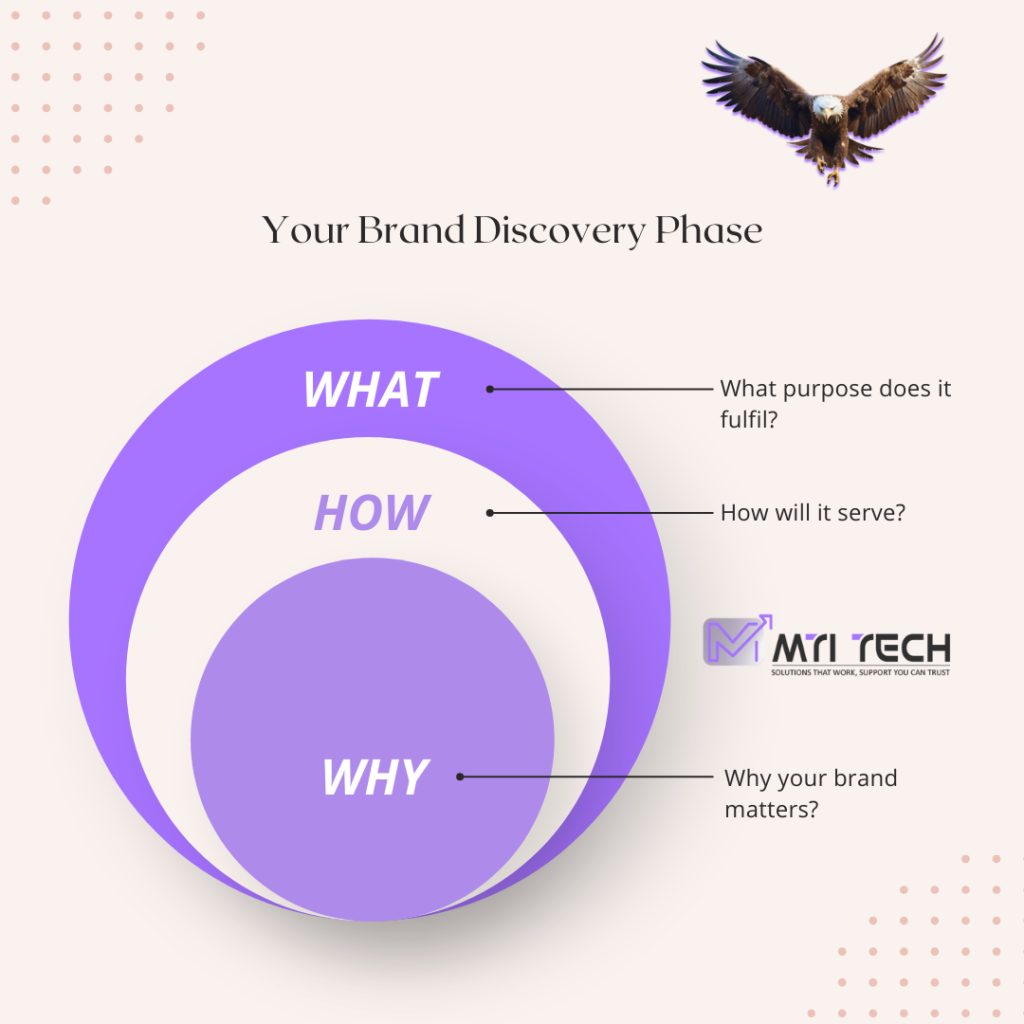
True self-discovery starts with the “Why.”
As codified by Simon Sinek, most companies know What they do (e.g., “We sell coffee”). Some know How they do it (e.g., “We use organic beans”). But very few know Why they do it (e.g., “We believe in waking up the human spirit”).
Your Brand Identity Strategy is the process of uncovering that “Why.” Are you the “Hero” archetype, here to save the day? Or are you the “Sage,” here to offer wisdom? If you don’t know your archetype, your website will have a personality crisis. A conflicted personality creates friction; a clear identity creates peace.
From Abstract Identity to Concrete Visuals
Once you have discovered who you are, you must translate that abstract feeling into concrete design elements. This is where Visual Identity comes into play.
- Color Psychology: If your self-discovery reveals that you are a calm, trustworthy medical brand, you might choose deep blues and soft teals. If you chose bright red, you would be fighting your own identity, creating subconscious stress for the user.
- Typography: A “Modern Innovator” brand should use sleek, Sans-Serif fonts. A “Traditional Luxury” brand relies on elegant Serifs.
Alt text: The Golden Circle Diagram
Checklist: 5 Questions for Your Brand Discovery Phase
To begin this journey of self-discovery, sit down with your team and honestly answer these questions:
- If our brand was a person, how would they speak? (Loud? Gentle? witty?)
- What is the one thing we want users to feel when they land on our homepage?
- Who is the villain in our customer’s story, and how do we defeat them?
- What values will we never compromise on, even to make money?
- Why does the world need our brand to exist?
Mapping the Journey: The Customer Experience (CX)
In our title, the word “Journey” is not accidental. A visitor does not magically become a customer the moment they land on your site. They travel through a specific path—a narrative arc—that takes them from stranger to loyal advocate.
To ensure this trip is one of serenity rather than frustration, you must engage in Customer Journey Mapping.
This map is the blueprint of your user’s experience. It visualizes every touchpoint a user has with your brand, ensuring that at each stage, they feel guided rather than lost.
Charting the Path: The 4 Stages of the Journey
A typical digital journey isn’t a straight line, but it generally follows four phases. Your job is to provide “digital peace” at each one.
Awareness (The Stranger): The user has a problem and finds you.
The Goal: Clarity. Do they immediately understand what you do? (See: Cognitive Ease).
- Consideration (The Explorer): They are comparing you to competitors.
- The Goal: Trust. Is your content authoritative? Is your navigation intuitive?
- Decision (The Buyer): They are ready to act.
- The Goal: Simplicity. Is the “Buy” button visible? Is the form short?
- Retention (The Advocate): They have purchased and need support.
- The Goal: Support. Is it easy to find help documentation or contact support?
Removing Obstacles on the Path
The purpose of mapping this journey is to find the “potholes”—the friction points that disrupt the user’s serenity and cause them to abandon the trip.
In UX Design, we call these “Drop-off Points.”
- The 5-Field Form: Asking for too much information too soon is like proposing marriage on the first date. It creates anxiety. Solution: Reduce forms to email addresses only for the first step.
- Hidden Navigation: If a user has to click three times to find your “Pricing” page, they are working too hard. Solution: Flatten your architecture.
- Dead Ends: A “Thank You” page that doesn’t tell the user what to do next leaves them stranded. Solution: Always provide a “Next Step” (e.g., “Read our latest guide” or “Check your email”).
By smoothing out these bumps, you transform a jagged, stressful trek into a seamless User Flow that feels natural and inevitable.
The Mirror of Data: Self-Discovery Through Analytics
In philosophy, self-discovery requires honesty. You must look in the mirror and see yourself exactly as you are, not as you wish to be.
In the digital world, that mirror is Data Analytics.
Many businesses operate on assumptions. They believe their homepage is serene. They believe their brand identity is clear. But Data Analytics for UX strips away these delusions and reveals the cold, hard truth of how users actually experience your site.
Seeing Your True Self Through Data
To achieve true digital self-discovery, you must learn to read the reflection in the mirror.
- Bounce Rate (The Rejection): If 70% of people land on your page and leave immediately, the data is telling you a hard truth: Your experience is not serene. It is likely confusing, slow, or irrelevant.
- Time on Page (The Engagement): If users are staying for 3 minutes, they are finding value. Your identity is resonating.
- Conversion Rate (The Connection): This is the ultimate validation. It means the user felt safe and understood enough to take action.
Heatmaps: Visualizing the Struggle
Sometimes, numbers aren’t enough. You need to see the behavior. This is where User Behavior Analysis tools—specifically Heatmaps—become essential.
A heatmap shows you exactly where users are clicking, scrolling, and hovering. It often reveals shocking truths about your design:
- The Rage Click: You might see a cluster of red clicks on an image that isn’t a button. This is frustration. The user wants to go there, but you haven’t built the path.
- The Cold Footer: You might see that only 10% of users ever scroll to the bottom of your page. If your “Contact Us” button is down there, you have effectively hidden it.
The Feedback Loop: Continuous Self-Discovery
Self-discovery is not a one-time event; it is a lifecycle.
In the Agile methodology, we call this the “Build-Measure-Learn” loop. You launch a design (Build), you check the analytics (Measure), and you discover what needs to change (Learn).
By treating your website as a living entity that evolves through data, you ensure that the journey of serenity never ends. You are constantly polishing the mirror, removing friction, and getting closer to the perfect experience.
Frequently Asked Questions (FAQ)
To help you navigate your own journey of digital self-discovery, here are the answers to the most common questions about User Experience and Brand Identity.
Q: What is the difference between UI and UX?
A: Think of a horse. UI (User Interface) is the saddle, the stirrups, and the reins—the tools you use to ride. UX (User Experience) is the feeling of riding the horse. Is it smooth? Is it fast? Is it scary? You can have a beautiful saddle (UI) but a terrible ride (UX). You need both to achieve serenity.
Q: How long should the Brand Discovery Phase take?
A: For a comprehensive digital transformation, a thorough Brand Discovery Phase typically takes 2 to 4 weeks. This includes stakeholder interviews, competitor analysis, and archetype definition. Rushing this step often leads to an “identity crisis” later in the project.
Q: Why is “White Space” so important in web design?
A: White space (or negative space) reduces Cognitive Load. It gives the user’s eyes a place to rest, allowing them to focus on your key message without feeling overwhelmed. It is the primary visual tool for creating a feeling of serenity.
Q: Does UX design actually affect SEO rankings?
A: Yes. Google uses “Core Web Vitals” as a ranking factor. If your site has poor UX (slow loading, shifting layouts, broken buttons), users will “bounce” (leave quickly). High bounce rates signal to Google that your site is not helpful, pushing your rankings down.
Conclusion: The Destination
We began this discussion with a search for peace in a chaotic digital world.
It is easy to view a website as just a collection of code and images. But to your user, it is an environment. It is a place they visit. If that place is cluttered, loud, and confusing, they will leave. If it is clear, fast, and welcoming—if it offers Serenity—they will stay.
But you cannot offer that peace if you do not possess it yourself.
The journey of Self-Discovery—of digging deep into your data, defining your brand archetype, and mapping your customer’s path—is the price of admission for digital success in 2026.
Is Your Brand Ready to be Discovered?
Your website should be a mirror that reflects the best version of your business. If the reflection looks blurry, it’s time for a change.
At MtiTech, we don’t just build websites; we craft experiences. We guide you through the discovery process to find your true voice, and we design user journeys that turn frustration into flow.🚀 Start Your Journey Today.
Don’t let your brand get lost in the noise.
Click here to explore our UX Design & Brand Identity Services and let’s build a digital home that offers true serenity.